Twitter

Search This Blog

Showing posts with label mixed media. Show all posts

Thursday, March 18, 2010

Acrylic grounds for mixed media

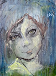
It's really easy for me to fall in love with materials. These past few years I've been dating acrylics. First, it was Tri-Art's gorgeous Artist Acrylic colours that won me over, then their innovative recycled paint Sludge...then I fell madly in love with Dry Media Ground, and now I just can't get enough of Nepheline Gels (the following artwork is graphite, charcoal and pastel on Nepheline Gel Coarse, and it's published in the New Acrylics Essential Sourcebook: Materials, Techniques, and Contemporary Applications for Today's Artist mixed media chapter). Just as I'm known for charcoal, acrylics have now become synonymous with my mixed media works, blurring the line between drawing and painting. Acrylic grounds allow me to create a textured surface that is very exciting and different than just working on common surfaces. And just like paper, I can soften dry media (graphite, charcoal, pastel) to a velvet finish with a brush, and also leave crisp edges, intense with colour or value.

Dry Media Ground is simply perfect, and will always be my true love! When you apply it to a surface, the result is like a very fine sandpaper. If you have ever used a pastel paper or board, that's what I'm talking about - it's the same thing, only it's much more cost effective to buy the Dry Media Ground in a jar and then you can create your own surfaces the way you want them. You can add colour to it or even apply it on top of layers of acrylic paint, creating a new surface of possibilities! On the other hand, Nepheline Gels have a unique granular texture and appearance. It's available in a fine (which is not as fine as dry media ground), a coarse and extra coarse. Just like Dry Media Ground, Nepheline Gel can be mixed with colour or used on it's own, glazed over top of and anything else you can think of....and it's a brilliant surface for graphite, charcoal, pastel and other drawing materials.

Gesso is a common ground for sealing surfaces for painting preparation. I love drawing on Gesso with graphite or charcoal. Gesso is a very dense White, but it is also avail in Black, Burnt Umber or Canvas colours, and even better, Tri-Art recently came out with a Clear Gesso and it's absolutely fabulous for tinting.  I also find it particularly useful when I have a beautiful piece of birch that I want to prepare and yet incorporate the natural wood surface into the art itself. I use to draw right onto wood and yet have found that over time the wood gets oily and stained and dirty, and I can already see that my newer pieces will last longer simply because the wood is primed. On that note, though I am an experimental art materials pixie, I've learned that there are some rules you should follow...there will always be plenty of rules you can still break! A few rules I recommend for all artists: always use good quality materials, take the time to experiment and get to know your materials, and prepare, finish and safely store your art. 


A few secrets to relieve any fear of acrylics and mixed media:
  • all acrylics and mediums are ok to mix. it's recommended to mix artist quality with artist quality/student quality with student quality and so on, but that aside don't hesitate to try new brands. Company's often has a signature colour or product, such as Tri-Art's new Artist Acrylic colour 'Golden Orange' and it's good to step out of your comfort zone even in regards to your favorite brand of paint!
  • acrylics are the most versatile medium out there, and can be used on a variety of surfaces and combined with any dry or water-soluble medium....and you can really open up new worlds by exploring collage and sculptural materials. 
  • Rheni Tauchid's book New Acrylics Essential Sourcebook: Materials, Techniques, and Contemporary Applications for Today's Artist will inspire and is a handy reference with detailed charts on how to prepare your surfaces, using acrylics with other mediums, media and materials.
  • it's ok to fall in love with your materials ...the paint, the canvas, the brushes, the tools... and the play, the journey, the creative process

     
 MY FAVORITE QUOTE TODAY!
Creative people are curious, flexible, persistent and independent with a tremendous spirit of adventure and a love of play. ~Henri Matisse

Friday, February 12, 2010

Cityscape mixed media paintings

My cityscape series was in a group show last October, and recently featured on the Empty Easel Blog with a fabulous review. These works explore offbeat urban environments, created by abstracting the architectural and natural design elements of our beautiful and yet edgy cityscape.

From my love of drawing, I have developed a process of charcoal worked into layers of paint. I begin by drawing the basic and most important shapes, then layering dramatic values with minimal, harmonious colours. I draw into the paint with a charcoal stick, and use large Escoda Bristle brushes to blend the dry media to create rhythm in the line. I live for the final stages of adding textured and dark energetic marks.

Working with charcoal reminds how simple line is pure and beautiful, and some lines are so wonderful that instead of working with them, I work around them. It is an intuitive process working in harmony with the properties of the materials. There are beautiful collisions of media that become the forefront of my work and I hope it allows viewers to be curious and imaginative about the artistic process and result. 

Please visit my website to see the whole series, and for prices and availability.

Monday, December 7, 2009

Sunshine Magazine covers Winter Fairy!

We can learn a lot from young artists starting out. I am privileged to know such talented kids who have such supportive and encouraging families.  I teach private art classes for some home schooled kids and more specifically a girl named Karoline once a week. I customize and work one-on-one with her, to discuss her artistic likes and dreams, and help her determine projects that will help her grow and reach her goals. One of our last projects of the year is her very best. Perfect for her portfolio! She created it and worked through the new parts, the hard I've never done this before parts, the I don't like this anymore parts and because of her courage and dedication, she is learning a lot quickly. The mistakes and the not every thing you do will work out but the more you do, the more will turn out reality-check is sticking, and so is the knowledge, persistence and encouragement. And encouragement and love is everything. And, I love love it when they succeed!
So this incredible piece was created by Karoline Kayser. I've been coaching her since May 2009, teaching her anatomy, portraiture, drawing, painting, colour and composition. She's only 12 years old now, and is talented, enthusiastic and dedicated. Her spirit and creativity is inspirational. I think she is remarkable, and I think this watercolour/pastel  painting 'Winter Fairy' is a masterpiece! Check out the emotion,  detail, colour, texture, story and character! I'm sooo proud to say that her mother submitted  the painting, and it was chosen to be the cover of Sunshine Magazine for the Winter edition www.sunshinemagazine.ca WOW!!! congrats Karoline! You ROCK darling girl!


Sunday, November 8, 2009

Duho Panels

Recently I had the awesome experience of joining Tri-Art in Pasedena, CA for the Learning & Product Expo:ART! and meeting the people who own Duho panels. As you know, I love materials, and it's what primarily inspires my own artwork. WELL, everything Duho makes is perfection - beautiful and stunning exotic woods like bamboo and zebrawood to metal copper panels and more. You might want to check them out for yourself: www.fineartpanels.com. Honestly, I have to remember to breath when I put down my first stroke on these gorgeous panels, but after that it's an absolute pleasure to be an artist.

Here are two mixed media works on Duho panels...

Zebrawood panel 12"x12"

Walnut panel 12"x12"

I am very excited with the result of staining the walnut with Tri-Art's liquid Golden Orange...currently my favorite colour! Both of these panels are part of my ongoing BURNT TREES series....which I should probably blog about soon :)

Thursday, August 27, 2009

Summer Art Class in Paradise


I organized another 'Art Day in Paradise' last Sunday. What an incredible group of artists! I must say, it is equivalent to bliss, eating, drinking, drawing and painting. And it goes far beyond that, as we share artistic visions with each other. The concept is similar to an open studio, with direction, and one of the coolest things is all acrylic paint materials are provided for by Tri-Art. I usually bring in other media (I love drawing mixed with painting) and really goal to make it as experimental and inspirational as possible. I'm an uber-curious person, I question everything! I believe experiments, samples and notes should be made.....like an artistic scientist in a mad lab! muahahaha.

I've booked another class for Sept '09 and was thinking about scheduling one every month! Stay tuned.....

www.sharlenawood.com

Tuesday, August 4, 2009

Feature Artist: Claudia Jean McCabe


I love this woman
www.cjmccabe.com


Montreal-born claudia jean mccabe is a recognized Canadian painter, graphic designer, teacher, creator of musings, storyteller....and dreamer. Over the course of her artistic career, she has participated in numerous solo, featured and group exhibitions at both provincial and national levels. This award winning artist is an elected member of the Society of Canadian Artists. mccabe's paintings are held in private, corporate and government collections worldwide.

Saturday, March 21, 2009

SHARED PALETTE art entertainment


What is Shared Palette? Well, it's one of the major things in my life that keeps my heart beating...it's my passion, my dream job. I can relate to many people when the say that it took them a long time to discover what that was because, well, I had to create it! And Shared Palette was designed out of my love of art and people, teaching and sharing ideas = Art Entertainment! The most important part of the concept is that it is an interactive experience. The magical formula consists of an artist (me!) and many guests who all happily create together. From the Corporate suit to the red carpet ballgown, my aim is to engage everyone to collaborate with me in the creation of a single painting. You do not have to paint the whole canvas yourself, this is a team effort! The painting comes together as everyone makes their own unique brush stroke of colour! And I not only provide the opportunity for everyone to add their own mark, but to also be involved in the process of making a work of art, with the same approach, techniques and materials that a professional artist does.
So what is Shared Palette? Well, it's really an amazing, shared experience that you will never forget.


visit www.sharedpalette.ca for more info.


Monday, March 9, 2009

DRAWING: Use Bread as an Eraser?


When I saw this article in American Artist, I instantly thought of Jim Dine. At a workshop I took early Dec ’08 we watched a video of Jim preparing an exhibit for a German gallery of large wall drawings - charcoal works drawn directly onto the walls. I just loved it, for many reasons: He uses his hands and non art material related tools such as charcoal tied to a stick/rags/bread to erase, he was intuitive in his approach (the ultimate visionary), and that the art was temporary (to be painted over at the end of the exhibit).

‘Drawers used the soft parts of bread to erase marks made by lead, graphite, chalk, and crayon. Bread was readily available (except perhaps for the most starving of artists), and when it comes to erasing marks, the only important thing is strictly physical: The eraser component must be composed of molecules that are stickier than the molecules of the drawing surface so that the marking material is pulled away from the surface and adheres to the eraser.’
excerpt from Post Feb 24 2009 by Bob Bahr - American Artist
inage: Athena's Night, Jim Dine, 1995
charcoal and isolated areas of pastel, 79 1/8" x 41"

ps. I really really want to draw on walls.

Sunday, March 8, 2009

ARTIST: John Virtue

John's high contrast paintings are like large charcoal drawings. I find it most intriguing that he handles shellac and ink on raw canvas with a cloth in his hands...and I just love his ink spray bottle ♥
Image:
Landscape No. 704, 2003-4 - acrylic, black ink and shellac on canvas 244 x 244 cm